Hello again! As promised, this is The Big Textbox Post. The skeleton of this overhaul has been done for quite a long time and I’ve been really itching to talk about it, so I hope everyone is fine with me rambling a bit! As should always be the case when we present anything, keep in mind that things are subject to change as development goes on, but otherwise…
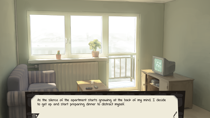
So, the textbox has been completely redone, and now looks like this:
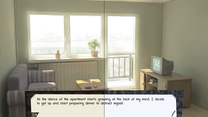
The goal was to drive the paper-y aesthetic even further forward with the presentation, while also allowing more versatility with direction. Like with First Snow, you’ll be able to swap between Fall and Winter themes if you have a preference. Each theme has its own unique background pattern during narration on top of the usual color changes!
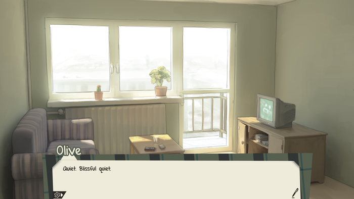
The big change, however, comes when a character speaks. Rather than a simple colored name, we’ve given each character a tailor-made pattern that runs alongside the edges of the textbox. These patterns should make recognizing the speaker even easier, and this also solves a problem with First Snow’s textbox, in that some character nametags got sorta lost in some backgrounds.
Due to the layering of the UI, the speech tail is also adaptive rather than baked into the images. This means it’ll be able to 1:1 follow characters in real-time rather than just guestimating their positions. This last part’s a big deal: First Snow had a variety of customization options to account for accessibility and personal preference. This textbox is relatively static and doesn’t offer the flexibility of First Snow’s. So naturally our solution was to make a second textbox.
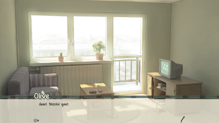
We’re calling this the “simple” option. While the base textbox is designed for aesthetics, we also wanted the simple textbox to also look visually appealing while also being streamlined enough to allow for customization. On top of the options present in First Snow, we plan to add an opacity slider for the simple textbox, and naturally the Fall/Winter variants will be available for it as well.
With all of these options available, we believe you’ll be able to fully customize the UI In Twofold to fit your exact tastes and needs. See you next time!


Looks really nice, thanks for the update!